Photographing Paris (& Other Places): A Non-Lesson


I'm always shy of using the word 'lesson'. Nobody wants to be lectured. So this is a kind of a non-tutorial in the art of photography.

As with all non-tutorials, you don't have to follow it. You can just look at the pictures. And if you want to chime in with non-tutorial comments of your own, you're very welcome. After all, I'm still learning about photography. My partner jokes I'm a graduate from the "Click-And-Pray School" of photography, and it's not far from the truth. I always hope the photograph of a scene I see will be as good on screen as it is in reality.

Sometimes it isn't. Sometimes the real thing is so beautiful, so ethereal, I can't possibly capture it with a simple lens. But occasionally I can. Here are some simple things I've learned over the years. Oh – and a good camera helps too! Mine has recently died. RIP.


SHOOT WITH YOUR HEART, NOT YOUR HEAD
I don't take photos of scenes that I think I should take photos of. I take photos of scenes that I want to remember when I'm old and wobbly and and unable to hold a gin and tonic, let alone a heavy SLR.

This photo was taken at the end of a long day walking around Paris. I was crossing a bridge to the islands at exactly the right time. I remember stopping and gazing at this beautiful scene; the light, the clichéd boat, the whole, romantic, Parisian perfectness of it. It touches my heart every time I see it. Take photos that touch your heart.

Don't worry if the composition isn't perfect. The memory will be.


CONSIDER THE LIGHT
Lighting is such a big part of photography. It can make or break a photo. I love shooting cities at twilight. It's the best time of day to take a camera out. A gorgeous sky can make an average composition, such as these (above), look almost acceptable.


CONSIDER COLOUR
Colour is so uplifting. Bold colours can make a photograph come alive. Think of the colours of India, or the Bahamas, or a garden in spring. Try to look for colours when you're walking around. They can be anything – a cafe, a storefront, a gallery wall, even a man in a pea-green coat!
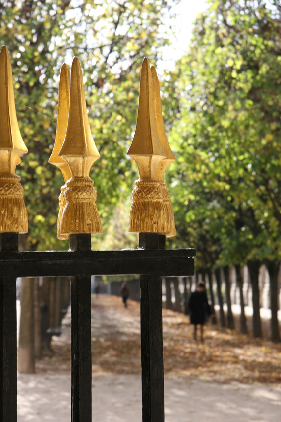

LOOK UP
So many travellers spend their days looking down, at the pavement (cobblestones can make it tricky to walk, I know), or at the street scenes around them, but I think the best scenes are above head-height. Think about the incredible detail of Paris' wrought-iron balconies. The sky passing over the rooftops. The sheer spectacle of the architecture and skyline. Catherine Deneuve's apartment is the enormous greenhouse high above the Square Saint-Sulpice. I wouldn't have known this had I not looked up. (And been told it the day before!)


FOCUS ON A THEME
If you find a colour, a subject matter or a theme you like, try to shoot around it. It will give you a series of photos that have more cohesion than just a whole lot of random shots. I'm partial to gilt things so I'll often shoot scenes that have gold in them. We have a wall here at home with these gilt pix, all framed in gilt. They not only remind me of Paris every time I walk past, they also make me smile.

And that, I think, is what the best photos should do.

Paris in September


I've always loved Paris in September. It's truly magic. The weather is still warm, but the evening air is cool, and as the leaves begin to change shade there is a wistfulness to the city as Parisians sigh over the inevitable end of summer, pull on their cardigans and trenchcoats, and head resignedly into autumn. 


Many of the bars, bistros, grassy knolls and café terraces are jammed with people at once embracing and mourning the lingering sun. In fact, it's not uncommon in September for Parisians to take the afternoon off, if the day is lovely, in order to sit somewhere and reflect upon life for that contemplative period between brunch and l’apéro. It is summer’s end, and, as happens every year in Paris, the city doesn’t know whether to be satisfied or sad.


This time of year is known as la rentrée. A particular Parisian syndrome (and a fabulously onomatopoetic description if ever I’ve heard one), it refers to the time of year when Parisians return to town after their summer sojourns and the city stretches, sighs and repositions itself, in an urban version of yoga, to mentally and physically ready itself for the months ahead. People unpack their suitcases and empty the beach sand from their coloured Bensimmons, children return to school, and the rest reacquaint themselves with their boulanger, fishmonger, neighbours and friends to catch up on the summer gossip (otherwise known as being branchée, or plugged in). In essence, la rentrée is when routine resumes with a quiet new solemnity. Even though much of the city is stressée (stressed) and pressée (in a hurry).


As the city slowly returns to normality after the ebbs and flows of summer, thoughts turn to deadlines, to diaries and social functions, and – as Fashion Week approaches – even to new season’s wardrobes.

Life in Paris is moving into another gear. A new year has begun.


{All photos © copyright Janelle McCulloch 2012}

Diana Vreeland: Pink, Red & Tangerine Dreams


"There's only one very good life, and that's the life you want, and you make it yourself". 
Diana Vreeland

Before Anna Wintour, before Grace Coddington, even before Anna Piaggi (who sadly passed away 2 days ago), there was another extraordinarily creative and ever-so-slightly eccentric talent who put her own exclamation mark on the fashion world. She died 23 years ago this month, but her name still invokes respect among the fashion cognoscenti. She was Diana Vreeland.


The great photographer Richard Avedon once said of DV: "She was and remains the only genius fashion editor". I would argue that Grace Coddington is up there as well, but yes, Diana Vreeland commands her own spot on the dais. She began her career as a columnist and a fashion editor for Harper's Bazaar, and rose through the sartorial ranks to eventually land the top job: editor-in-chief of US Vogue, which she ran from 1963 until 1971. Her influence was legendary. She even advised Jackie Kennedy on her wardrobe during the Presidential campaign. She was also close to Coco Chanel and perhaps fired off more witty bon mots than the latter did. When the Vreelands moved to a new apartment, which was decorated by Billy Baldwin in bold, blood red, their parties became legendary and included the likes of C.Z. Guest Cole Porter and of course Cecil Beaton, who would never miss a DV soiree. In 1957, Paramount decided to make a musical, Funny Face, featuring Audrey Hepburn and Fred Astaire, which has since become a cinema classic. They based the magazine editor character of Maggie Prescott on Diana Vreeland.


Her biography, D.V. which she wrote in her later years, remains one of the wittiest, funniest, most interesting memoirs I've ever read – although I'm not sure how much is embellished and how much is truth? I suspect more of it is truth than creativity. Diana Vreeland always did lead an extraordinary life.

Next month, the life of Miss Diana will be again highlighted in a new documentary, Diana Vreeland: The Eye Has To Travel. It's the first feature-length documentary on her life and work. The documentary features taped recordings of Diana Vreeland, as well as interviews with Ali McGraw, Anjelica Huston, Manolo Blahnik, David Bailey, Diana von Furstenberg and various Vreeland family members. It's released in cinemas on September 21, although check for Australian dates. The official trailer is here: here. (www.youtube.com/watch?v=HP3wsNdANhM)

And here, in tribute to DV, is a little post on her favourite shades: red, hot pink and tangerine. (Even her nurse as a child was called 'Pink'.) DV, we still miss you.


Fashion journalist Anna Piaggi, who sadly passed away 2 days ago. One of the greats.


A glimpse of Blair Waldorf in an Oscar de la Renta frock, who, like Diana, has never been shy of colour.


The uplifting interior of Ann Lewis, recently featured in Australian Vogue Living online's files.


Two photographs by architectural photographer Robert Polidori. I've just discovered Mr Polidori. His images of Versailles are astonishing. And his Cuba photographs are even more beautiful. Diana would have loved him too, I think. She liked photographers who think outside the lines.


The now-famous red-and-pink room by designer Miles Redd, whose name is as memorable as his interiors.


Not sure of the source of this stunning library, but I just adore it. The citrus sofa, orange cushions and pink print are all unexpected, and utterly gorgeous.


A wall of my study. Not quite as glamorous as the tangerine and citrus room above! But hopefully mine will look as well stocked as the above space one day.


Memories from Angelina in Paris, 2011. (I bought this just so I could photograph it. I loved the colours so much I couldn't bare to take a bite.)


A pink door, photographed on the same trip to Paris. Only in Paris!


Not sure of the source of this moodboard. {Please contact me if you know and I'll credit immediately.} Look at the polka-dot pink and tangerine parcels. What a great little gift to give to guests when they leave.


Manuel Canovas' beautiful 'Bengale' fabric, via Faux Fuchsia. Doesn't this remind you of India? Diana would have loved this print. She was a fan of India's bold shades.


A favourite cover from Conde Nast Traveller magazine. The dress is by Bottega Veneta.


A gorgeous frock from Tigi New York. I may be heading to the Bahamas this New Year's Eve for work. This would be the perfect thing for the Junkanoo parade and fireworks over the beach. Look at the pink underslip. So lovely. (I'd never heard of Tigi until I saw this dress. Must get out more!)


A clip from Sambag's SS12 Collection. Love the quirky hat as much as the dress. It reminds me of a lovely old vintage bathing cap.


A corner of our cluttered spare room: hot pink-and-tangerine taffeta curtains, pink beach umbrella, tangerine ottoman and pink fabric leftovers. I love the reflections of the trims here on a sunny day.


One of my favourite stores in the Canal St Martin part of Paris. The colours in this store are so bold, it's as if a couple of paint tins exploded. But it's so fabulous, you can't help but smile when you walk in.


And at the other end of the aesthetic spectrum (less funky; more sophisticated) is the Hotel Pantheon in Paris, one of my favourite places to stay. (Tip: Ask for the pink-and-red rooms that overlook the Pantheon. They're quintessentially Parisian, and some of the prettiest in Paris.)


And lastly, some peonies from the streetmarket in the Bastille part of Paris. You can't go to Paris without buying a tiny bouquet of hot pink flowers...

The Enduring Appeal of Navy Blue


I'm a navy girl. Always have been. I think it comes from spending so long in France. They love navy there. Especially in Paris. If pink is the navy blue of India, as Diana Vreeland once famously said, then navy blue is quite possibly the black of Paris.

Navy is sophisticated and elegant. It's classic. Timeless. Tasteful. Even when i's used in a high-glam way, it's still beautiful and understated. Indeed, it couldn't look cheap, even if it tried. (Something that can't be said for black.) If Brynne Edelstein wore navy, she'd look like a Hollywood movie star from the 1940s. Not like... well, the wife of someone with too much money.

Some people dislike navy because it's too safe. It reminds them of school blazers, and police uniforms. I don't have this aversion. My St Margaret's school blazer was yellow. Well, more of a dirty shade of brown-gold, like leftover vindaloo. Perhaps that's why I can't wear brown. I have terrible issues with it. But navy...  Ah,  navy. I could live in that shade.


Which is why I've painted our main bedroom and dressing room (above) in a colour the shade of Chinese porcelain. Our new house is high on a hill and the top floor looks over the lights of Melbourne. This blue seemed to suit the space. It was the exact same colour of the city sky at twilight.

Navy blue. If only I could persuade more people in this beautiful city to convert to it.

PS Thank you for all of your lovely comments re my mother. I was so very touched, and promise to reply tonight, after I collect my nieces and feed them and entertain them, and generally do the dutiful aunt thing!


Too, too lovely: London designer Faye Toogood. {Vogue Living Jan/Feb 2011}


Blue note: Jill Sander dress, top and skirt. {Harpers Bazaar, May 2011}


Dot to dot: Kate Spade 'Lisa' polka dot wedding shoes. {From current collection}


Flights of (feathered) fancy: Kate Spade 'Elliana' evening clutch. {From current collection}


Making a statement: British Elle Decoration, which loves doing its section pages in navy blue.


Tasteful in Tasmania: Leo Schofield's dining room in his historic Georgian house in Tasmania. The walls are painted Bible Black, a dark shade of navy that's the colour of old bibles. {Via Vogue Living, Jan/Feb, 2011}


Blue for two: The work of Akin Creative (Kelvin Ho and Jeremy Hull) in Sydney. Akin has just collaborated with Sibella Court on Justin Hemmes' latest project, Ms Gm in Potts Point. {Via Belle}


Cute kitchenalia: A page from Elle Decoration, which dedicated an entire section to royal and navy blue in its March 2012 issue.
Powered by Blogger.