An Affair With Orange


Orange is one of those sneakily seductive colours. You don't notice it right away, which is strange because it's extroverted enough. But it does take a while to recognise it between all the hoopla that black, white, red, cobalt, hot pink and even yellow make. Orange is like the quiet wit of the colour party. It waits until there's a suitable pause in the conversation, and then says something so clever, or funny, or just plain charming, you wonder why you hadn't noticed it before.

2012 has been a big year for orange. Trend forecaster and colour experts Pantone nominated Tangerine Tango as the Colour of the Year For 2012. Tangerine, they said, would be the colour to watch. And it was. In fact, many of us fell in love (or back in love) with the vivacious, summery shade of ripe mandarines. {Above image via Luella}


We're now winding down the year, and Pantone is making new predictions for 2013, one of which is that Art Deco-inspired shades will become very big; a trend inspired, perhaps, by The Great Gatsby. So here, to send tangerine out in style, is a tribute to this year's unexpected hit.

So long orange. We had a great time.

Wishing you all a fun-filled weekend.


"Orange is the happiest colour." 
Frank Sinatra


170 East 78th Street, New York. {Via Curbed}


J Crew's new collection.


Hermès.


Iris Upfel's apartment. As elegant as the woman herself.


Jessica Lange, looking radiant at the Emmy Awards recently. {Hollywood Reporter}


Fabric from Black & Spiro's design studio. {Via Absolutely Beautiful Things}


A spread from Vogue China. {Via Dustjacket Attic}

A Hermès beach pareo.


A design from Artiga fabrics in France. 
(Their canvas fabrics make great deckchairs, drapes and chaise covers. They're fabrics for those who have grown tired of Les Toiles des Soleil.)


A cover-up from the beautiful Balinese fashion label Mist, widely available in Australia.


A rug design from The New York Rug Company.


A rug design from Madeline Weinrib.


Barefoot style in India. {Via Mist}


A pair of Mandarina dancing shoes.


Marimekko's New York store. Gorgeous window merchandising. This was an entire dinner party created from fabric. Just extraordinary.

Hermes School of Decorating, Part 2


Since the first post on The Hermès School of Decorating was such a surprise hit, I thought I'd try another. Orange is still making headlines as a colour (the effects of Pantone's Tangerine Tango prediction perhaps?), and in fact is starting to be recognised as a 'classic' for women's wardrobes, alongside white and black. (It always looks amazing with either one.)


Someone told me recently that the Preppy's answer to orange was coral, but I don't know. I still think orange has a lot of life (and style) left in it... I don't know about you but I'm looking forward to a long hot orange summer.


Hermès' new wallpaper range, which is inspired by its scarves. The collection includes ‘Bibliothèque’, a drawing of a collection of equestrian books, and 'Pêle-mêle', a panorama in which horses and Hermès family members are playfully depicted. “We wanted to offer the possibility of dressing your home with that same Hermès quality and style," says a Hermès spokesperson. I love the orange print (above), which seems to epitomise Hermès' quirky elegance. The papers landed in stores in June this year.


A splash of orange lifts this monochromatic interior. I'd love a Hermès blanket but they're $1600 here and our dogs would make them look like $1.60 blankets within a day. {Via Habitually Chic}


The office of Japanese interior decorator Yasumichi Morita. Such a beautiful backdrop. {Via The Selby}


More framed scarves. This trend of framing silk scarves seems to be coming back into interior fashion. It's a lovely idea. Hermès scarves are so expensive they're almost investment pieces. {Via Skona Hem}


Although this is perhaps taking the scarf-as-art thing a bit far... {source unknown}


This was cute: a classic Chanel No 5 bottle reimagined in orange for a watercolour. If only Chanel re-released it in this shade? {Via Habitually Chic}


Christian Louboutin's country house. Look at how he's even decorated the doors and chairs in Hermès orange. Some people might think this is too much, but I think it's beautiful. Although it only works because of the scale of the room. {Via German Architectural Digest February 2007}


Grace Coddington's new memoir, designed with an uplifting, slightly retro, Cecil Beatoneque-meets-Hermès shade. Out in November. (I've already put it on the Christmas Wish List.)


 David Hicks' books on decorating. David was a big fan of Hermès orange. I've been trying to find editions of these but without success. (Cheap editions, that is.) Will keep looking. I love the turquoise cover: David Hicks on Living With Taste. Makes me laugh every time I see it.


Here's a vintage copy in Kate Spade's SoHo New York store. It wasn't for sale. I asked. They use them as part of the merchandising. Very witty. Although I'm not sure if David would have approved... (He would have gone in and rearranged everything.)


A classic film poster in an unexpected shade. Funny Face, with Miss Audrey.


Sweet! Although if the bike was in orange, it would be even better. {Via Russian Vogue}


A cheery orange carousel in Lisbon Portugal. I have a thing for carousels. Love them. LOVE them. There are several in Paris, and they always make for beautiful photos. {Via This is Glamorous}


America's First Lady Michelle Obama publicising her kitchen garden book. Michelle's a fan of orange too. And not just in the garden. {Source forgotten; will find and credit}


More coral-red than orange, but I'll still take it! Love this. Imagine it on a beach somewhere? {Ditto source}


A vintage Dodge in just the right shade of Hermès orange, perfect to cruise the summer streets in. Love this dashboard. Weren't cars simpler back then? The bucket seat is cute too. Oh, for a car like this! This is a real beach car.


I found this on iTunes the other day while searching for Stevie Nick's songs. (I was having a Seventies moment.) Loved the cover. Although I'm not sure what the third song, 'Fertilizer', is about?


Loving this too. So fabulous. Orange trench. Orange boots. Orange handbag. Too much, do you think? Perhaps. But isn't it eye-catching? I could see this on the streets of New York this winter. It almost needs a shiny black vespa to complete the outfit. Wish I knew who designed this coat. The bag looks very Hermès-ish.


Diana Vreeland: Pink, Red & Tangerine Dreams


"There's only one very good life, and that's the life you want, and you make it yourself". 
Diana Vreeland

Before Anna Wintour, before Grace Coddington, even before Anna Piaggi (who sadly passed away 2 days ago), there was another extraordinarily creative and ever-so-slightly eccentric talent who put her own exclamation mark on the fashion world. She died 23 years ago this month, but her name still invokes respect among the fashion cognoscenti. She was Diana Vreeland.


The great photographer Richard Avedon once said of DV: "She was and remains the only genius fashion editor". I would argue that Grace Coddington is up there as well, but yes, Diana Vreeland commands her own spot on the dais. She began her career as a columnist and a fashion editor for Harper's Bazaar, and rose through the sartorial ranks to eventually land the top job: editor-in-chief of US Vogue, which she ran from 1963 until 1971. Her influence was legendary. She even advised Jackie Kennedy on her wardrobe during the Presidential campaign. She was also close to Coco Chanel and perhaps fired off more witty bon mots than the latter did. When the Vreelands moved to a new apartment, which was decorated by Billy Baldwin in bold, blood red, their parties became legendary and included the likes of C.Z. Guest Cole Porter and of course Cecil Beaton, who would never miss a DV soiree. In 1957, Paramount decided to make a musical, Funny Face, featuring Audrey Hepburn and Fred Astaire, which has since become a cinema classic. They based the magazine editor character of Maggie Prescott on Diana Vreeland.


Her biography, D.V. which she wrote in her later years, remains one of the wittiest, funniest, most interesting memoirs I've ever read – although I'm not sure how much is embellished and how much is truth? I suspect more of it is truth than creativity. Diana Vreeland always did lead an extraordinary life.

Next month, the life of Miss Diana will be again highlighted in a new documentary, Diana Vreeland: The Eye Has To Travel. It's the first feature-length documentary on her life and work. The documentary features taped recordings of Diana Vreeland, as well as interviews with Ali McGraw, Anjelica Huston, Manolo Blahnik, David Bailey, Diana von Furstenberg and various Vreeland family members. It's released in cinemas on September 21, although check for Australian dates. The official trailer is here: here. (www.youtube.com/watch?v=HP3wsNdANhM)

And here, in tribute to DV, is a little post on her favourite shades: red, hot pink and tangerine. (Even her nurse as a child was called 'Pink'.) DV, we still miss you.


Fashion journalist Anna Piaggi, who sadly passed away 2 days ago. One of the greats.


A glimpse of Blair Waldorf in an Oscar de la Renta frock, who, like Diana, has never been shy of colour.


The uplifting interior of Ann Lewis, recently featured in Australian Vogue Living online's files.


Two photographs by architectural photographer Robert Polidori. I've just discovered Mr Polidori. His images of Versailles are astonishing. And his Cuba photographs are even more beautiful. Diana would have loved him too, I think. She liked photographers who think outside the lines.


The now-famous red-and-pink room by designer Miles Redd, whose name is as memorable as his interiors.


Not sure of the source of this stunning library, but I just adore it. The citrus sofa, orange cushions and pink print are all unexpected, and utterly gorgeous.


A wall of my study. Not quite as glamorous as the tangerine and citrus room above! But hopefully mine will look as well stocked as the above space one day.


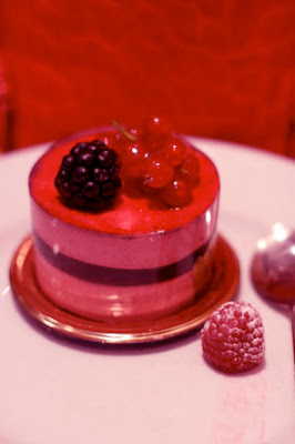
Memories from Angelina in Paris, 2011. (I bought this just so I could photograph it. I loved the colours so much I couldn't bare to take a bite.)


A pink door, photographed on the same trip to Paris. Only in Paris!


Not sure of the source of this moodboard. {Please contact me if you know and I'll credit immediately.} Look at the polka-dot pink and tangerine parcels. What a great little gift to give to guests when they leave.


Manuel Canovas' beautiful 'Bengale' fabric, via Faux Fuchsia. Doesn't this remind you of India? Diana would have loved this print. She was a fan of India's bold shades.


A favourite cover from Conde Nast Traveller magazine. The dress is by Bottega Veneta.


A gorgeous frock from Tigi New York. I may be heading to the Bahamas this New Year's Eve for work. This would be the perfect thing for the Junkanoo parade and fireworks over the beach. Look at the pink underslip. So lovely. (I'd never heard of Tigi until I saw this dress. Must get out more!)


A clip from Sambag's SS12 Collection. Love the quirky hat as much as the dress. It reminds me of a lovely old vintage bathing cap.


A corner of our cluttered spare room: hot pink-and-tangerine taffeta curtains, pink beach umbrella, tangerine ottoman and pink fabric leftovers. I love the reflections of the trims here on a sunny day.


One of my favourite stores in the Canal St Martin part of Paris. The colours in this store are so bold, it's as if a couple of paint tins exploded. But it's so fabulous, you can't help but smile when you walk in.


And at the other end of the aesthetic spectrum (less funky; more sophisticated) is the Hotel Pantheon in Paris, one of my favourite places to stay. (Tip: Ask for the pink-and-red rooms that overlook the Pantheon. They're quintessentially Parisian, and some of the prettiest in Paris.)


And lastly, some peonies from the streetmarket in the Bastille part of Paris. You can't go to Paris without buying a tiny bouquet of hot pink flowers...

Powered by Blogger.