Have you ever made a reservation at a bar or brasserie just to see the interior design? Me too. Sometimes I don't even notice the food. I'm too busy looking at the font on the menus. Or the serif writing they've used on the vintage gilt mirrors over the bar. Shallow, I know, but I'm sure there are many of us who are more curious about the decor than what's in the cassoulet. It's dining by design.
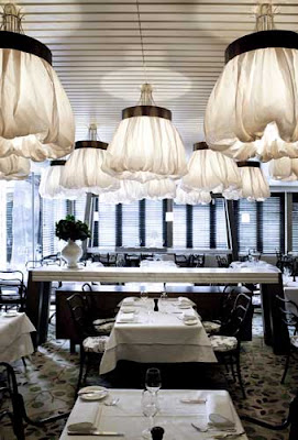
This subject has come to the table (watch the pun there) because on Sunday my lovely man took me to Bistro Guillaume for my birthday, just so I could see the ballgown light shades that everyone's been talking about for years. While he was tucking into his French poulet I kept saying thing like: "Do you think they're custom-made?" Poor man. It can't have made for an interesting conversation.
So here, as a little 'belated Birthday Post', are my Top 10 Bistro Interiors. Places to go when you need inspiration for your kitchen, your butler's pantry, your outdoor terrace, your own restaurant project or just want a little more design sauciness with your duck parmentier. Oh! The pun(s) we could have! And yes, I swiped the paper menu from under my plate so I could archive that particular shade of green. Not as bad as Diana Vreeland pinching a piece of wall for its pink paint. But almost. {All images via the respective dining establishments' websites. Credit for top image is uncertain, so please notify me if it is yours or you know the source.}
NB These are all casual brasseries and bars. A round-up of beautiful restaurant interiors will come in a later post.
BISTRO GUILLAUME
I've said enough about this sexy Melbourne brasserie. I'll let you be the judge of that geranium-green bar and those gorgeous ballgown lampshades. (I did comment that they would be cuter with pairs of Moulin Rouge-style legs and tiny Manolo shoes dangling out of them, but I don't think Mr Guillaume Brahimi would have thought that was quite fitting.) Whiteman Street, Southbank, Melbourne, Australia. www.bistroguillaume.com.au {Images via The Age and Miettas.com}PEELS
The staff at John Derian recommended this place. Great find guys. (It's right next door to Derian's Dry Goods store.) New York magazine said it offered one of the best places for brunch in the city. Tall call, but I'll accept it. The menu is fab, but the decor is even more fantastic. (See? I told you green was IN.) 325 Bowery, New York. peelsnyc.com {Photos by me; please don't copy without a credit or link.}BALTHAZAR
Still one of the best places for a design perve, even after all these years. Keith McNally: you do it to me every time. I always, always come here whenever I'm in New York. (Tip: Come for brunch; it's easier to get a table.) {Photos by me: that's why they're not great. I think I might have had a G&T or three?} 80 Spring Street, SoHo, New York. balthazarny.comTHE LOCAL TAPHOUSE BAR AND RESTAURANT
Designed by Gardener & Marks (the 'Gardener' is Lyn Gardener of Empire Vintage and The White House fame), the Local Taphouse incorporates 110-year-old tram seats, framed vintage posters, factory lights, enamel signage and even fish traps. A little piece of Parisian wit and cosiness mixed with a Melbourne sensibility.There's also a Sydney version. 184 Carlisle Street, St Kilda East, Melbourne, Australia. thelocal.com.auTHE EUROPEAN
I've got a soft spot for The European. It's where I first met my lovely man. He was wearing a smart black suit and a crisp white shirt. I'm a sucker for black and white. Throw in The European and I was smitten from the first cheap rosé. The City Wine Shop bar next door (as part of the establishment) is just as elegant, and The Melbourne Supper Club and rooftop bar upstairs are two of the best for a drink in the city. I've known men who have seduced their dates (yes, right down to the, er, final gasp) right on the leather club chairs. That's how dim and sexy it is. (Although I never wanted to know which chairs they were in.) 161 Spring Street, Melbourne, Australia. theeuropean.com.au
COMME
I love Comme. I mean, Comme on! (As Leyton would say.) How could you not? It's glamour in a glass! For those not familiar with it, it's the old Mietta's, redressed for a good time. Black, white, sexy as all hell. Just seeing the staircase makes my heart beat faster. 7 Alfred Place, Melbourne, Australia. comme.com.au
JK PLACE
Okay, so it's a hotel bar/breakfast space, rather than a stand-alone brasserie, but look at that design! Don't you just want to rip the entire thing out, fittings and all, and take it home? 7 Piazza Santa Maria Novella, Florence. jkplace.comTHE BLUE BAR, THE BERKELEY
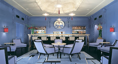
Still one of my all-time favourite interiors. Look at that Lutyens Blue! Created by London-based design meister David Collins, it incorporates a white onyx bar and a black crocodile print leather floor. Incredible. If I were single and meeting an incredibly nice man, I'd arrange to meet him here. Or The Connaught Bar in Mayfair. Another gorgeous hideaway. Wilton Place, Knightsbridge, London. www.the-berkeley.co.uk {Images via The Berkeley}THE MILLSWYN
Designed by star-chitects Hecker Guthrie and inspired by Keith McNally's New York brasseries Pastis and Balthazar, Melbourne's new Millswyn brasserie is a little piece of Sweden, a hint of Shaker simplicity, and a whole lotta understated glamour. It's almost a pared-down Parisian interior: the Left Bank without the cigarette smoke. It feels like it should be on a beach somewhere – St Barts, Sorrento or Shelter Islands. But for a Saturday brunch after a walk/run around the Botanic Gardens, nothing beats it. 131 Domain Road, South Yarra, Melbourne, Australia. themillswyn.com.auTHE SIP SHOPPE, NAPA VALLEY
First spotted on Slim Paley's blog, The Sip Shoppe is one part circus stripes and one part whimsy. This is how the owners describe it: "At first we called the room the Cirque, in reference to its 'bigtop' feel and French Quarter/New Orleans roots. As the space took on a mind of its own, we began referring to it as the 'Candystore for Adults'." Space, design, taste and style. I'd make the trek to Napa just to see those stripes. Napa Valley, California. www.sipshoppe.com


Nice post. It is really interesting. Thanks for sharing the post!
ReplyDeleteThanks for sharing.This is nice and helpful post.Restaurant Interior Design Melbourne