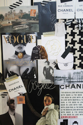
Collages have been around in the blogosphere and indeed the magazine and book publishing world for some years now. I remember seeing them being used in magazine spreads as early as 1999, although they really took off in the last decade. Some art directors feel that the collage has had its day, but I disagree. I think their simplicity and whimsy is timeless. No matter how ornate or amateurish they might be, their quirkiness never fails to enchant. We've framed lots of our travel mementos into collages and hung them around the house. There are collages of Do Not Disturb signs collected from hotels around the world; collages of vintage postcards I've found in Parisian flea markets, and all the collages I've designed for my books over the years, many of which have been used as end papers, contents pages, section dividers and acknowledgement pages.
Here are some of my favourites. It just goes to show that the art of collage isn't past its due-by date.
Below: Mock-up collages produced for Paris: A Guide to the City's Creative Heart, published by Plum/Pan Macmillan.
Below: Two collages of Coco Chanel, produced for a forthcoming book on Chanel.
Below: A collage of pages from a vintage copy of Picnic at Hanging Rock. The book was torn but it seemed a shame to throw it out, especially because it's one of my favourite novels. I simply used some old tape I bought at Merci in Paris and stuck the pages onto a gilt mirror. I don't know if it works, decoratively speaking, but I often pause and read the pages when I walk past.


0 comments:
Post a Comment